
The ONLY 12 Living Room Paint Color Ideas You Need to Know!
This post shares beautiful living room paint color ideas to refresh your space.
Some living rooms feel “almost” perfect, but not quite there. You may notice that everything’s in place, yet the space still feels a little flat.
More often than not, the wall color is the missing piece.
That’s where your list of living room paint color ideas helps. They help you shift the mood without moving furniture or taking on a full redo.
And once you land on the right shade, the room settles in differently. It feels calmer, more pulled together, and a lot more like home.
So, let’s check what I’ve got in store for you.
Best Living Room Paint Color Ideas For You
#1: Warm Off-White
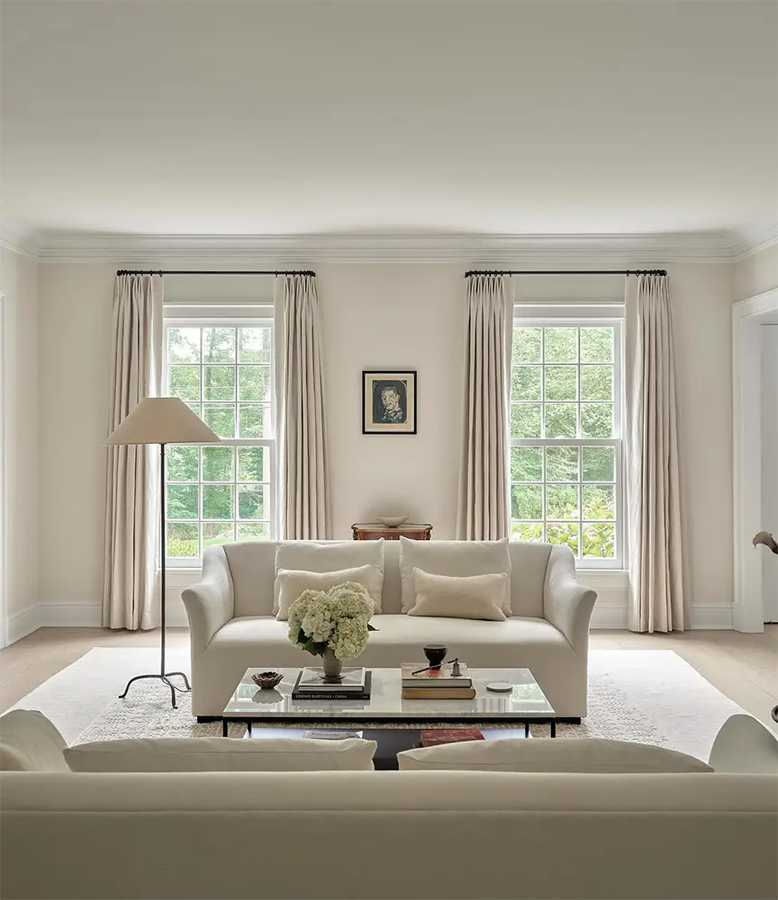
Warm off-white gives your living room a brighter starting point without feeling empty. It lifts the space gently, so nothing feels washed out or stiff.
It works well with almost any furniture, which is helpful if your sofa or chairs change over time.
Have you noticed how daylight feels softer on walls like this? I always like that part.
It makes the room feel calmer, and you do not feel rushed to decorate everything at once.
The color also makes it easier to adjust pillows, rugs, or art later without repainting.
#2: Soft Greige
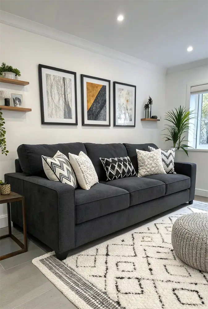
Soft greige sits right in that comfortable middle when white feels plain and gray feels cold. It also keeps the room balanced without pulling attention to the walls.
You can lean it warmer with wood accents or cooler with light fabrics.
I used greige in one living room where the furniture changed twice. The best part? The walls never felt out of place.
It also helps soften strong daylight, so the room looks even from morning to evening.
#3: Warm Beige
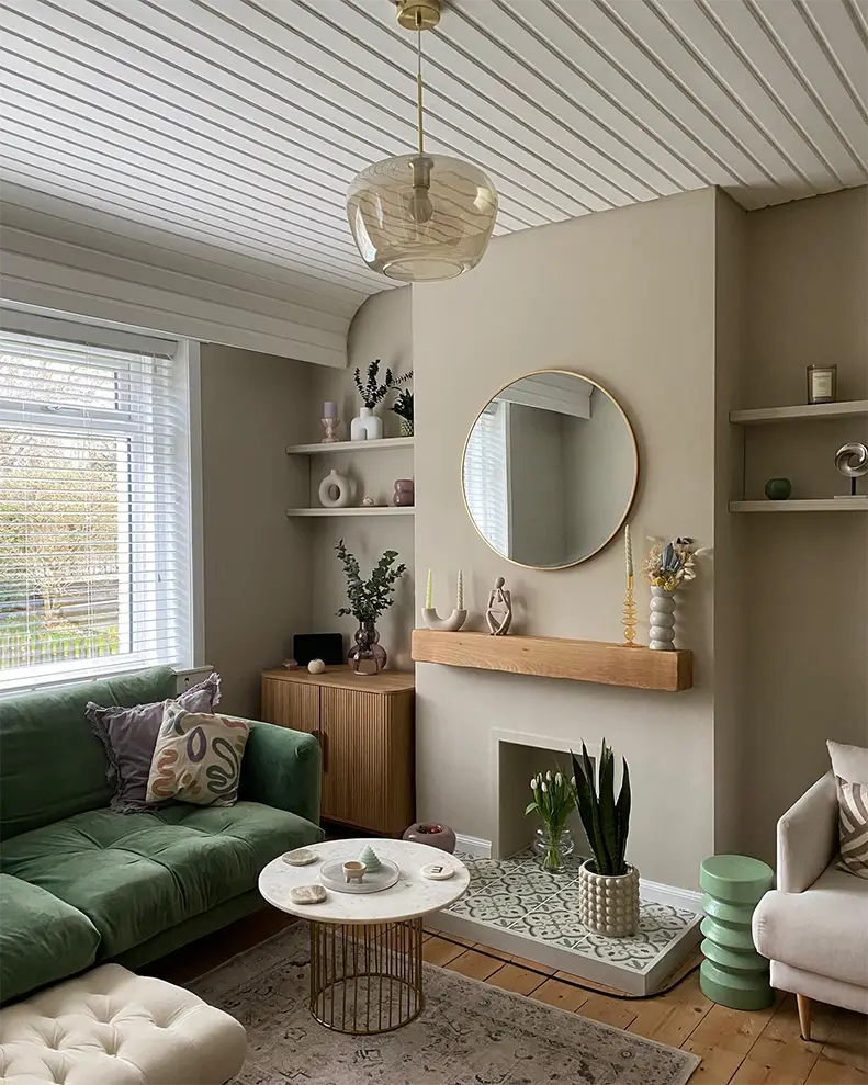
When you need a steady base, warm beige is your solution. Because it feels relaxed the moment you walk in.
And you can pair it easily with wood, woven textures, and soft fabrics.
You can build warmth gradually by mixing in light brown, cream, or soft golden decor. It prevents anything from feeling “forced”.
I love to see this in a room that feel welcoming but not heavy.
Small Tip: Pick a sample with a hint of warmth. It prevets the the walls from looking dull in low light.
#4: Light Taupe
Light taupe adds depth without pushing the room into darker territory. To me, it seems calm and still present.
You will love how it supports textures like linen, wood, and brushed finishes.
And I also like this one when I want a living room to feel pulled together.
It blends easily with warm browns and soft grays, so the space feels grounded and easy to live in. Isn’t that the goal anyway?
#5: Muted Sage Green
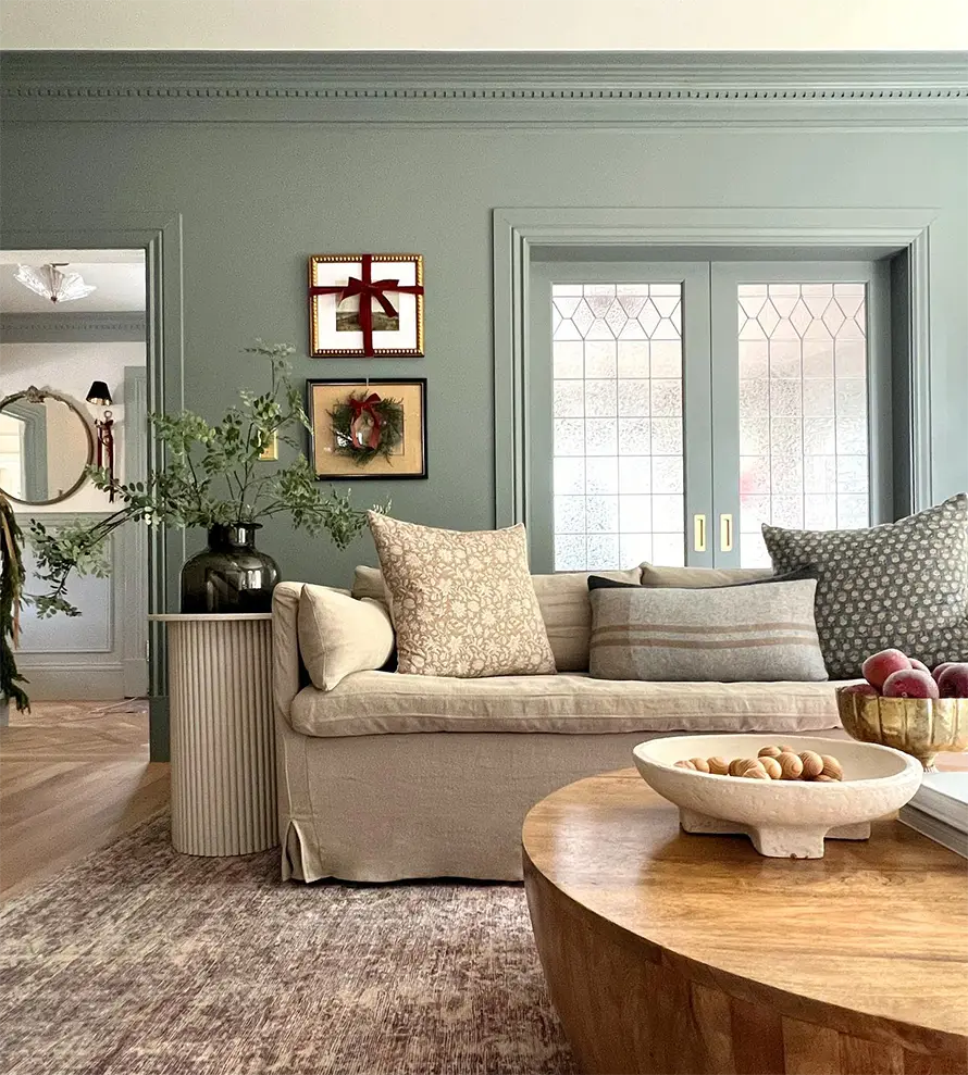
You know that calm feeling when a room finally exhales? Muted sage green does that without pulling focus from your furniture.
It adds a touch of nature, which I really like for rooms that need softness, not drama.
You will definitely notice how it blends well with light woods and woven textures.
It also behaves well in bright daylight, which means no weird color shifts halfway through the day.
#6: Olive Green Paint
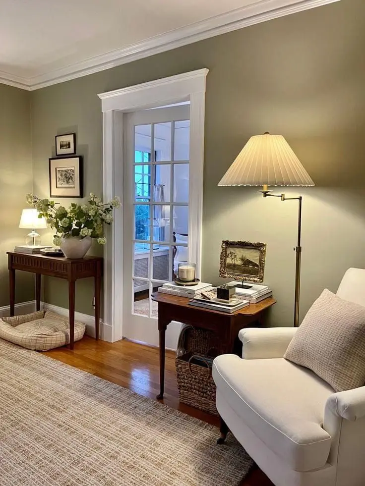
Olive has a way of making a room feel settled the second you walk in. It adds depth, yet the walls never feel heavy or closed in.
And you can lighten the look with warm white pillows or pale wood accents.
What really sells me on olive is how good it looks at night. Under warm lamps, it stays rich and cozy.
So, if you like rooms that feel calm but confident, this color quietly delivers.
#7: Pale Blue
I always smile when pale blue is used well. Doesn’t it just lift the room a little? Yes, it does. It adds freshness without feeling chilly.
I would say you can pair it with whites, creams, or even light oak furniture.
I’ve also noticed this shade works best in rooms with afternoon sun, since it stays soft instead of turning icy.
It’s a light, friendly color that stays steady throughout the day.
#8: Classic Navy Blue
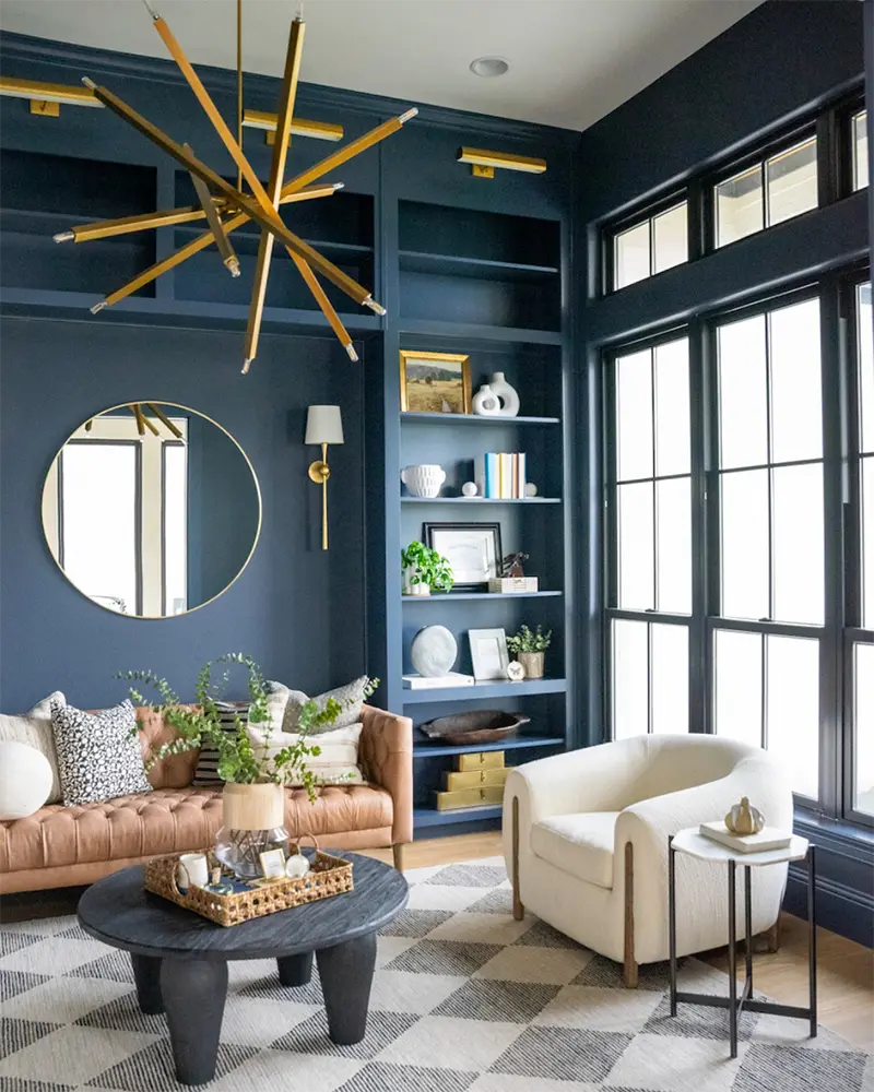
Navy walks in and immediately takes charge, in a good way. It grounds the room and lets lighter furniture, art, or metal accents shine.
Then keep the rest of the palette simple to make the walls feel intentional.
I like navy because it makes styling easier. I mean, just picture a bold rug or accent chair. That feels enough, right?
Pro Tip: Use a satin or eggshell finish so the navy reflects light softly.
#9: Charcoal Gray
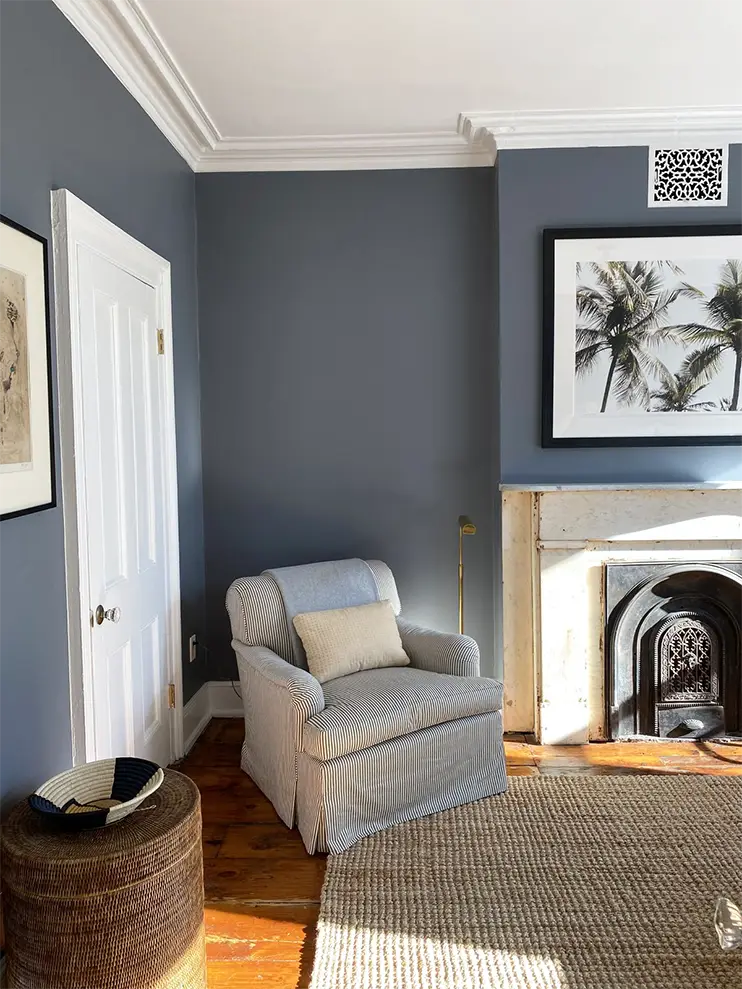
You know that moment when a room suddenly feels pulled together?
Charcoal does that in a steady, grown-up way. It adds depth, but it never feels overwhelming.
I like how this color lets everything else relax a bit. Lighter fabrics, warm wood, and brushed metal show up more clearly against it.
Charcoal also shines in the evening, when lamps soften the room. Oh, and the color feels cozy too.
#10: Terracotta
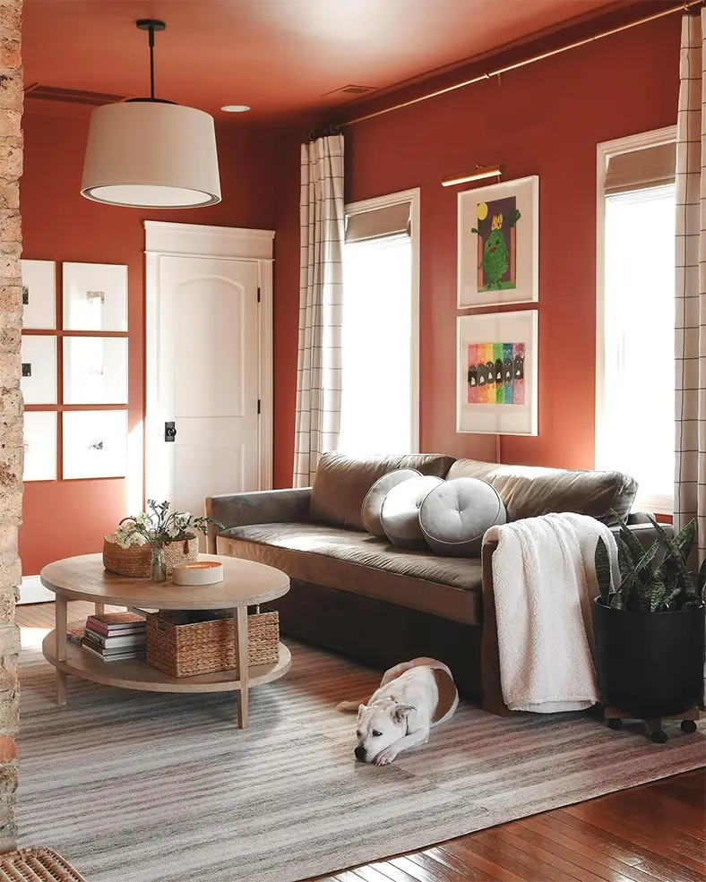
Terracotta has a warmth you notice right away. It makes the room welcoming when you step in.
I say it also brings a grounded, homey mood that feels natural and relaxed.
I once paired it with cream tones, textured rugs, or soft brown accents. Yup, loved it!
Then again, terracotta holds its tone beautifully in changing daylight, which helps the room stay steady from morning onward.
It’s a shade that makes the space feel lived-in and relaxed in a natural way.
#11: Soft Blush Pink Paint
Okay, hear me out before you picture a dollhouse.
Blush today is soft, calm, and way more grown-up than it sounds. It adds natural warmth, which is why it works so well in living rooms.
I once painted a small wall blush, thinking I’d repaint it fast if it felt off. A week later, it was still there.
It adds a gentle warmth that supports neutrals, wood tones, and softer fabrics.
You can make it lean modern by pairing it with muted grays or sandy beiges.
#12: Soft Black Walls
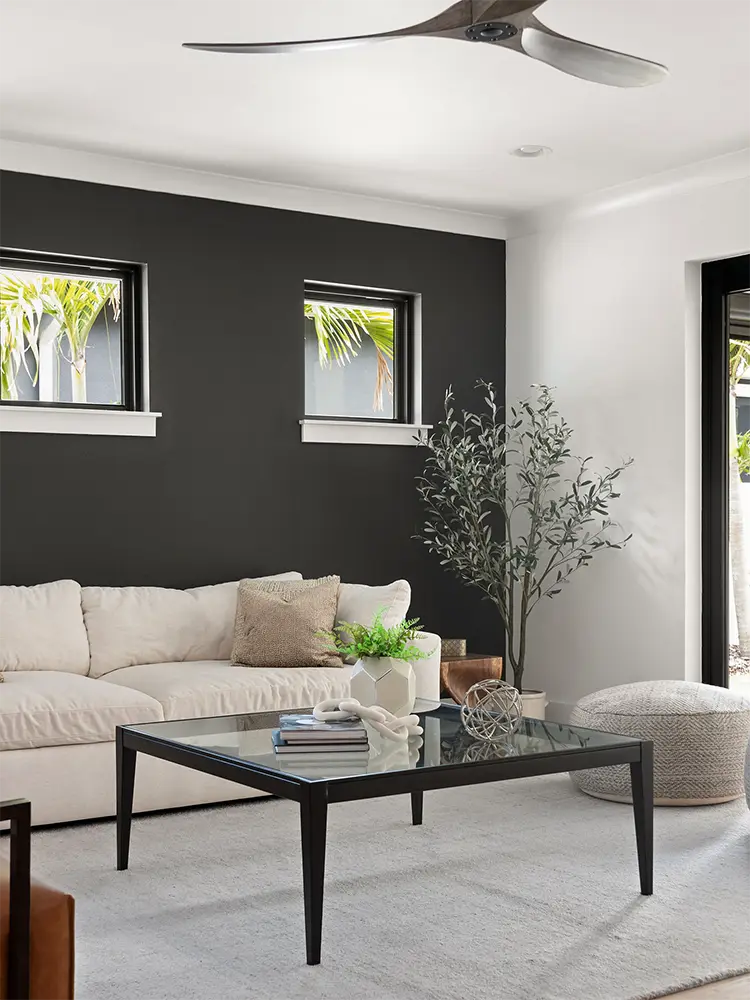
Yes, black walls. And no, your living room won’t feel like a cave if you do it right.
Soft black actually settles the space and makes lighter furniture feel clearer and more defined.
You can keep the rest simple with beige, off-white, or natural wood. In fact, this shade creates a steady backdrop that stays consistent day or night.
Tip: Use soft black on walls with good natural light or balance it with light rugs and fabrics.
Final Thoughts
All of these living room paint color ideas give you flexible paths to shape your space.
So pick the shade that fits your lighting, test a small patch, and see how it feels throughout the day. A quick color change often brings the room closer to the look you want.